Communication Books: Making Decisions About Format
- Four-year-old Josiah had a tiny one that was clipped to his belt loop so it was handy all throughout his day in preschool.
- Mr. Allan, who was hemiplegic and used a manual wheelchair, liked to keep one underneath his right thigh so he could grab it quickly whenever he wanted to talk.
- Dougie’s was big, really big, and he carried it under his arm wherever he went.
- Marla’s was a permanent fixture on her wheelchair laptray, and if she came without it because a caregiver forgot to put it on, it was likely to be a very l-o-n-g day.
- Geena’s looked like a DayPlanner and had it’s own special compartment in her purse.
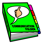
What are we talking about? Communication books, of course. And despite the fact that they all served the same general purpose, the communication books referenced in these examples couldn’t have looked more distinct.
In this week’s post, we wanted to talk about some of the options for formatting communication books. One size doesn’t fit all. In a pinch, we can make a generic format work until we’ve customized it for the individual, but the longterm goal is to have a communication book that is relatively easy for the AAC learner to use.
There are a couple of basic options to consider, and a lot of individual variations within each one. Before you decide on a format, though, give some thought to your client’s unique needs and how he/she will be using it. Form follows function. If the AAC user is ambulatory, for example, it needs to be portable. If the client is visually impaired, a small book presents some problems. If it is their main form of accessing language, there will need to be a lot of vocabulary. If the client is hemiplegic or can’t cross midline, turning pages will be an issue. A well-formatted book begins with what the client can do, what they struggle with, and how they will be using the book.
Here are some options to consider.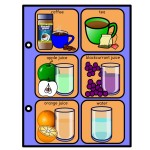
- Basic notebook style communication book: Pretty self-explanatory, but keep in mind that you can make these in any size. A full-sized binder might be the best option for some AAC users, but others would do just as well (and may prefer) something smaller.
- Communication book with flip sections: Allows the user to open to a page and then flip through a tabbed section to access additional vocabulary while still on that page. The Flip ‘N Talk is probably the most widely used example. You can read more about flip books on this page from the Bridge School.
- Communication book with fold-out panels: Think of a communication board with folds or hinges on both sides. those flip open to reveal additional pages of vocabulary.
- Working with people who communicate through no-tech eyegaze boards? A set of eyegaze boards can be loosely ‘bound’ together with rings for people whose best access is through eye pointing. You might have core vocabulary
- Mini book or wallet: These are great when there isn’t the need for a lot of vocabulary. For example, one woman we worked with had something like this for when the police pulled her car ov
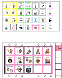 er. The severe apraxia she had made it difficult for her to explain that she had experienced a stroke. (Her son dragged her in for an AAC eval after having to bail her out on two occasions.) Her communication wallet had specific messages she used to converse with people who didn’t understand why she wasn’t responding orally. In most situations, she preferred to write, but the communication wallet was a better option for her at times .
 - Picture card ring: This isn’t technically a communication book, but we included it because sometimes there are specific situations in which a ring of pictures/text fits the bill. We’ve posted two of them (one for school and the other for community use) at our TeacherPayTeachers site (everything is free).
We can’t stress enough how important it is to reflect on the individual and the context in which the book will be used as you decide how to proceed. Here are some more things to think about.
- Color-coding: We love books that use colored backgrounds or borders on the pages so that communicators can get to the messages they want quickly. In Jenna’s book, her messages for public transportation were in the lavender section. When she was on the bus and needed to ask a question, she was able to flip quickly to that section. Anxiety reduced, crisis averted. Of course, you can’t assume that the AAC user will automatically understand your color-coding strategy. That’s something we have to teach as part of operational competence skills. That’s okay. We’re therapist. We can do that.
- Tabs: All books with more than 3-4 pages should have them to make navigating the book more efficient. We don’t want people slowly leafing through the pages to find what they want. Tabs can be labelled and color-coded so that the user can easily flip to a
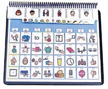 specific section.
 - Consider a Table of Contents (TOC) at the beginning of the book. Doesn’t it make sense to have an at-a-glance look at what the book contains? Bonus points if the TOC reflects the color coding you used to help the AAC user find sections more efficiently
- Separating pages with spacers makes it easier to turn the pages. Page fluffers can be made from a variety of materials, like pom-poms. (Look for a post about page fluffers/spacers later this month.)
- Open it: It’s best if the communication book stays open by itself. We generally try to avoid a situation in which they have to hold it open with one hand while they point to messages with the other. Not all our AAC friends have use of both hands, and some can’t coordinate their movements very well. That means we have to pay attention to the binding. A 3-ring, spiral, or comb binding adds bulk but these generally stay open better than a book that has a center staple.
- Turning pages can be troublesome for clients who are hemiplegic or who can’t cross midline. Consider binding it at the top instead of the left edge and putting the tabs at the bottom so that they can navigate the book more easily.
- Ask the stakeholder. You may be the one making the communication book, but, if all goes according to plan, someone else is actually going to be the one using it to convey their thoughts and ideas. Doesn’t it make sense to get their input on how they want the book to be formatted? There are many ways to approach this. Try showing your clients some examples or even a prototype to get their opinion. Use a rating scale to see what features they like/don’t like.
There’s so much to think about when making communication books, but remember our mantra: Do something. if your client doesn’t have access to good no-tech communication book (or board), just get started using whatever you’ve learned up until now. Whatever it is can be modified later on. More people get harmed by us waiting until the perfect tool is ready than they do by having something that is less that perfect. Commit to continuous improvement, but don’t wait until the perfect time to act.
Want to learn more or see some examples? Here are some web pages to peruse: ACE Centre, Scope Victoria, SET BC, TalkLink Trust.
images/SET BC/http://www.setbc.org/pictureset/SubCategory.aspx?id=74; Tony Jones/TalkSense
Filed under: Strategy of the Month
Tagged With: binder, communication book, flipbook, format, page fluffer, tabs, wallet
This post was written by Carole Zangari


3 Comments
Wonderful, prAACtical ideas!
Thanks so much Deb! One of the things great about a communication book is it is affordable and if you have a tech system and it has a problem, you still can communicate.
Communication book
Alfie Heeley