PrAACtically Visual: Supports to Organize Time and Tasks
We’re glad you’ve returned for Part 2 of Tabi Jones-Wohleber’s series on Visual Supports. As an AAC specialist, Tabi uses these with children who have complex communication needs and teaches others to incorporate them as well. Let’s learn some of the ways in which visual supports can be used to help with organization, transitions, and independence.
You can click on the images in the Downloadable Templates section to obtain the visual support files.
If you’re interested in seeing more of Tabi’s work, you can check out Part 1 of the series here.
:::::::::::::::::::::::::::::::::::::::::::::::::::::::::::::::::::::::::::::::::::::::::::
Visual and Environmental Supports to Organize Time and Tasks
“But he knows his schedule” isn’t the whole picture. We all use schedules to help us manage our time and keep us on track when non-routine activities occur. For instance, you may know your schedule for any given Tuesday, but what about that Tuesday when you have a dentist appointment. It only happens every 6 months, and not always on a Tuesday. It is important to teach individuals with complex communication and learning needs to manage their time and to respond to changes in the schedule, in the same way, we require these tools.
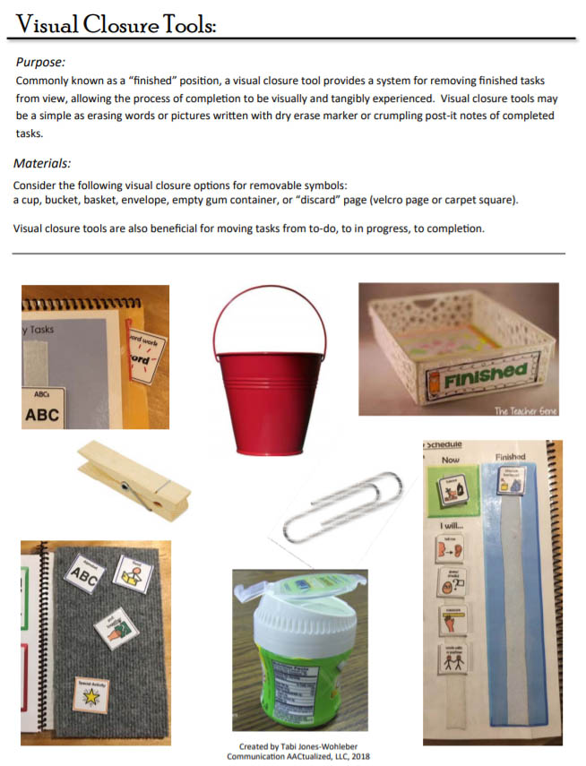
Visual and environmental supports for organizing time and tasks include visual schedules, mini-schedules or task analysis checklists, first-then boards, timers, lists, and other kinds of notes. Most often, visual schedules and task analysis checklists require a “finished position” to help individuals move through the process of managing activities on their schedule. Think about it: do you ever add items to your to-do list just for the satisfaction of crossing them off. I know I do! The act of indicating completion helps us move through activities and sustain our focus on the task at hand.
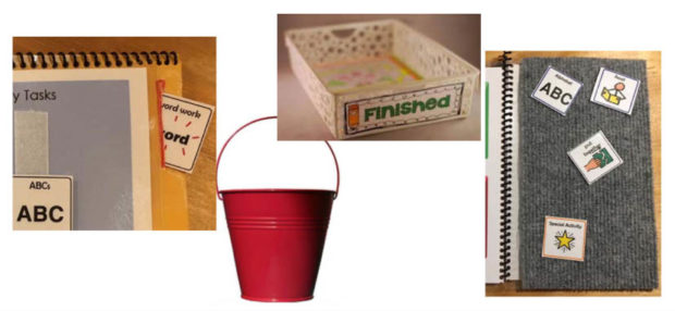
A finished position can take on many forms, including:
- A container such as a small box, bucket or basket
- A parallel strip of Velcro ® (“to-do” on left and “finished” on right)
- A pocket (pencil pouch) or envelope
- Wiping items off a dry erase list
- Crossing through items on a list
- Moving items to a “discard page” (a piece of carpet square)
The 4 types of visual schedules I most commonly see are classroom schedules, personal schedules, first-then boards, and task analysis checklists.
- A classroom schedule is an important reference in the classroom for reviewing the activities of the day and indicating what is happening now.
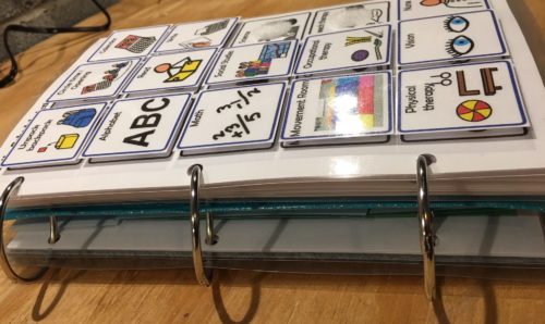
- A personal schedule is an essential companion to the classroom schedule. Most students participate in unique activities (such as visits to the nurse, or inclusion opportunities) or related services that may not be reflected on a classroom schedule. And whereas a classroom schedule is primarily managed by the teacher, a personal schedule is manipulated by the student facilitating increased attention to and ownership of tasks and activities.
- First-then boards facilitate an understanding of sequence by reinforcing a “have to” with a “want-to”. Once this cause-effect is learned, I encourage teams to move to a mini-schedule in which 2, then 3, then more tasks are required before reinforcement is offered. Over time this supports increased attention to task, and an increased ability to follow steps to complete a task.
- Mini-schedule or task-analysis checklists are also referred to as “within activity schedules”. In my experience, this type of schedule can be the most meaningful and engaging way to shape time but is the most underutilized. Breaking down the tasks within a class, project, or chunk of time in the day helps individuals understand expectations within the activity, anticipate how time will be spent and demonstrate sustained attention to the task.
Timers can support transitions, facilitate attention to task, and provide opportunities to check-in and review. However, they should be used with discretion as some individuals may become stressed by the use of a timer, or may become too distracted by a timer. Also, consider the output modality of the timer.
- Sand and liquid motion timers are silent visual timers.
- Simple kitchen timers have an auditory cue.
- Timers for those with vision and hearing impairment use vibration and lights.
- Timers available on digital platforms may have a variety of customization options.
IMPLEMENTATION STRATEGIES
- Use in natural contexts. For instance, when familiar activities occur in stories, seize the opportunity to reference when that activity happens on your schedule.
- Embed in routines. Reference schedule items and move activities to the finished position IN REAL TIME (not all at once just before lunch and at the end of the day…yes, I said it :). Pause between activities to ensure students have the opportunity to attend to and manipulate their schedule.
- Be Responsive. Different individuals require different features to benefit from and manage schedules. For instance, including symbols for unpredictable events such as a fire drill, early dismissal, substitute teacher, or room change may be critical for many. For some, a self-monitoring clip (Included in Go-To visuals support kit from Part 1 of this series) may be necessary to maximize attention to task and to tangibly experience a change in task or activity
- Foster Independence. Once you’ve initially modeled the use of the tool, use a least-to-most prompting hierarchy to support individuals learning to use their daily schedule or task checklist. Remember, we all use such tools; you are fading the support needed to manage the tool, not the tool itself (though what it looks like will likely change over time).
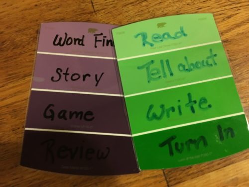
- Include Peers. Since we all use schedules to manage time, tasks and responsibilities, many students benefit from structure to learn these skills. Teaching peers to use such tools supports their development of executive functioning skills as well, and allows students to learn from, guide, and keep one another accountable. A paint-chip task schedule, for instance, is easily implemented classroom-wide
ACCESSIBLE BY DESIGN:
- Environmental Supports. Shape the environment to make it accessible. The tools I use most often include black backgrounds and upright stands to foster attention to task and reduce visual distraction. Arranging the environment so all pieces have a “home” is also necessary. This includes a storage place for schedules, symbols, finished positions, etc.
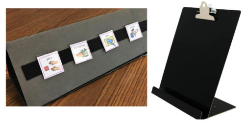
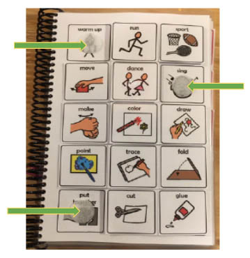
2. Interactive, but NOT distracting. Modes of interaction may include flipping symbols on a ring, marking off with dry erase, using a slide to put a frame around targeted selections, or arranging and moving symbols with Velcro®. Combinations of these may be used together. The careful balance to strike is determining the interaction mode that highlights the focus of the tool and does not cause unnecessary distraction.
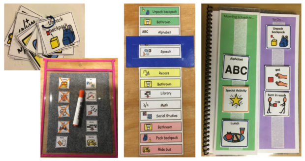
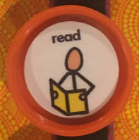
3. Multi-modal. Don’t feel stuck with paper and Velcro®. For portability and sturdiness, create a schedule on a paint stirrer. How about a Magna Doodle? They come in so many shapes and sizes. For individuals who crumple paper, I have found it useful to place symbols in Gatorade drink lids…it really gives something to hold onto. Pushing the lids through a slot cut into a slide pencil box provides proprioceptive input that also elicits engagement. The options are endless.

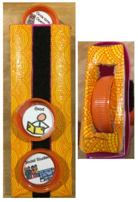
4. Clear purpose & process. Use labels to identify the purpose and movement of symbols so anyone who interacts with the individual can use it without the need for a tutorial. For instance, morning activities (top flap), afternoon activities (under flap), finished (column on the right). The importance of this becomes evident when you consider the high rate of staff turnover and limited opportunities for training in oh, so many environments.
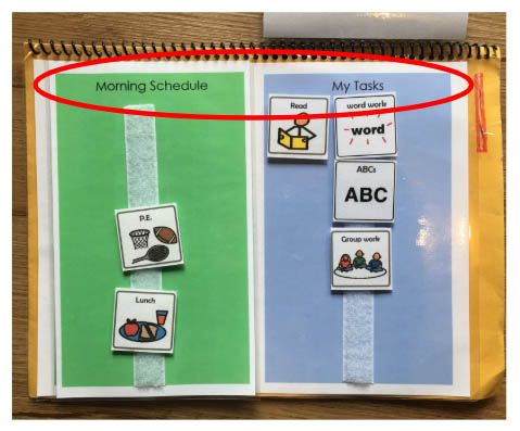
5. Keep it simple. Embrace readily available or easily accessible materials and engineer with only as much support is needed. Examples include portable whiteboards, post-its and paint chips.

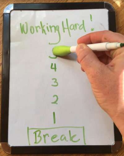
Design Tips
- Store symbols on storage pages. Print symbols in color to be cut apart, then print in black and white to laminate and bind as storage pages. Adhere movable/color symbols on corresponding b/w image on storage pages.
- Pay attention to the construction instructions on the schedule symbol templates below. You will notice it guides you to adhere symbols in strips, then cut apart while attached (rather than cutting out individual symbols). This is for efficiency and to prevent losing symbols in the assembly process.
Downloadable Templates
Schedule symbols for school, home & community
Round schedule symbols for school (use with Gatorade drink lids):
Full page schedule boards (daily, mini-schedule & more)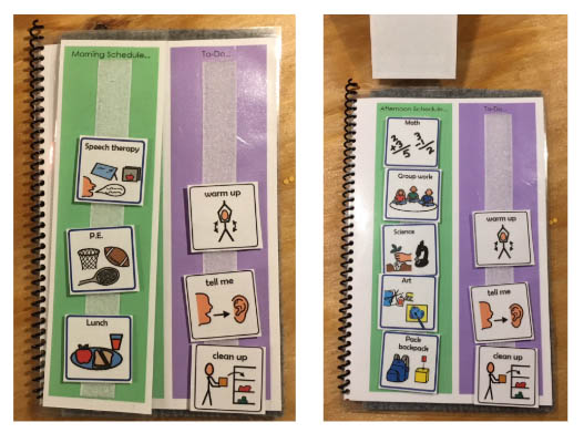
Half-page schedule boards (daily, mini-schedule & more)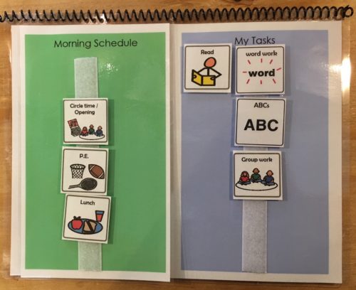
Daily schedule + finished position (daily & mini-schedule)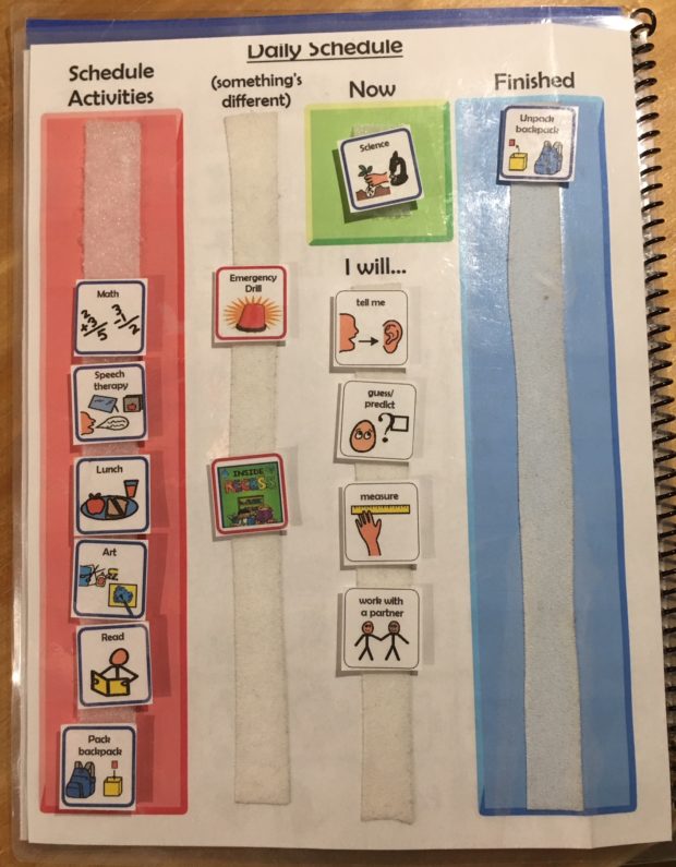
Visual Closure Tools
Filed under: Featured Posts, PrAACtical Thinking
Tagged With: implementation ideas, visual schedules, visual supports
This post was written by Carole Zangari




2 Comments
This is so great ! Thank you for including these examples.
I love the gatorade lid idea!! I have so many clients who crinkle or bend the images so I cannot wait to try this. Just need a lot of gatorade! LOL. Thanks so much, great post.