Communication Boards: Colorful Considerations
We love AAC technology and are deeply grateful for the options that are available to people with significant communication difficulties. We’re strong supporters of voice output systems and the autonomy they give to the children and adults with whom we work. On the other hand, we have great respect and much fondness for the “no tech” communication aids and visual supports.
As a student clinician, I made my first conversation book for Sherri, a young lady who had learned Bliss at school but had no communication materials in the institution where she was living. In my days as a clinical fellow, I got ratted out by Davey, a client who used his 100-location Bliss board to tell the supervisor that I gave out seconds on coffee even though the rule was one cup per person. (I knew I should never have taught him interjections!) There’s no doubt – communication boards can be powerful tools for expression.
This month, we’ll be talking about making and using communication boards. Why focus on the lowly communication board? Lots of reasons, actually, but the main one is this: Almost all of us have access to resources that will allow us to make communication boards. We may not have funding for a mobile device or AAC apps. We may be waiting for that SGD to arrive. But we generally have access to paper, a computer, and a printer. Throw in access to symbols, a laminator, or even clear contact paper, and we have all we need to begin developing tools that can give our clients access to language. Real language.
In this post, we’re focusing on the use of color to help us organize vocabulary so that the AAC users can locate specific messages quickly and efficiently. Later in the month, we’ll talk 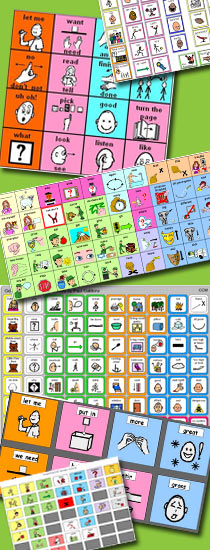 about combining core and fringe vocabulary, designing boards for different purposes, and teaching activities.
When I first started working in AAC, there were few options for using color in AAC symbols. When concrete, realistic images were needed, we were limited to cutting pictures out of magazine or using photos taken with actual film and developed at the local drugstore. With more stylized, abstract images, we basically had symbols photocopied from books or AAC device overlays. There are still plenty of SLPs around who spent quality time with crayons and highlighters coloring the backgrounds and borders of symbols so we could differentiate symbols by part of speech or grammatical function.
While I don’t necessarily miss the evenings hunched over the table trying to color within the lines, I do think we lost something in the process. Let’s face it, when clinicians spent time coloring in symbol backgrounds, they got VERY familiar with the color coding system. (“What color is PLEASE?” “Is MORE a descriptor?” “What part of speech is green?”) What we lost in time, we gained in working knowledge. In those days, any SLP who got close to AAC knew the color guidelines from Carol Goossens’ and Sharon Crain or used their own modification. They could combine this with their knowledge of the Fitzgerald Key and design activity-based communication boards in their sleep.
When computers and color printers made the process of getting colored symbols easier for us, that close-up-and-personal knowledge of how to use color effectively slowly faded for some clinicians. Here’s a quick refresher.
First, a comment about the lack of color. For some reason, a lot of us think that realistically colored symbols are ‘better’ than black and white symbols. Our assumption is that the addition of color, (making the car blue and the grass green, for example), helps people learn or remember the meaning. Not necessarily so. In fact, there has been much research in the area of marketing and those results advise us to use the least amount of detail necessary to convey the meaning. (Is a car more of a car because it is blue? No, but a symbol for grass may be easier to recognize if it’s green. Except if you grew up where my kids did and the grass was the pale yellow of hay in August, and a kind of grey-brown for most of the winter.) There has been quite a bit of research in the area of AAC symbols, but we’ll leave that for another day. For now, the take-away is this: don’t assume that black and white symbols will be harder for learners than realistically colored symbols. That may or may not be true for your particular learner.
Color coding symbols by grammatical categories or parts of speech is a well-established practice. There are two main approaches to doing this, the Modified Fitzgerald Key, and the system developed by Goossens,’ Crain, & Elder.
Modified Fitzgerald Key
- Blue: Adjectives
- Green: Verbs
- Yellow: Pronouns
- Orange: Nouns
- White: Conjunctions
- Pink: Prepositions, social words
- Purple: Questions
- Brown: Adverbs
- Red: Important function words, negation, emergency words
- Grey: Determiners
Goossens,’ Crain, and Elder
- Pink: Verbs
- Blue: Descriptors
- Green: Prepositions
- Yellow: Nouns
- Orange: Questions, negation, pronouns, interjections
Both conventions are used in AAC. Which one should you use? Whichever seems best for the clients you serve. The most important thing about the color coding schema is that it stay consistent. We don’t want to make a communication with pink verbs only to find that the SGD displays verbs in green. It’s important to check in with anyone involved in making or choosing AAC materials for your client so that everyone is on the same page.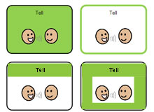
Ways of Coloring
Using color coding by part of speech can help the communicator locate the desired message on a communication board. There are three basic ways to implement this:
Background: The cell has a colored background fill. Sometimes the background fills the entire cell and other times a white box is left around the AAC symbol or the text.
Border: The cell has a colored border. Borders can vary in shape and line thickness to further differentiate classes of words. E.g.,Main verbs might have a thick green border and auxiliaries could have a thin green border.
Title Bar: The area around the text has a colored background but the rest of the cell does not.
Again, the most important thing is to be consistent in using these strategies. If a thin pink border signifies a present tense verb on one of Johnny’s communication boards, then that same border should be used on his other boards, SGD, AAC app, etc.
Do you have thoughts on using color in creating communication books? We’d love to hear them.

Filed under: Strategy of the Month
Tagged With: color, color coding, communication book, Crain, Elder, Fitzgerald Key, Goossens', no tech, strategy
This post was written by Carole Zangari

14 Comments
What a great post! I love the helpful color-code information, this will be great to use with one of my favorite apps “TalkBoard”. Thanks for sharing your knowledge!
Thanks for the kind words, Kian. If you get around to applying this to TalkBoard, send us some screenshots. We’d love to see your work!
Thanks for all this info Carole! Do you have a reference list on this? I’m having trouble finding any recent literature looking at this… but maybe I’m looking in the wrong places 🙂
Thanks!
I have several patients with Aphasia and can’t find Indian, Chinese or Farsi speaking SLP. Do you have communication boards in other languages? If not, where should I look. Any App suggestions? Please help a good OTR out.
Lori Sue, here are some adult communication boards in various languages: http://www.alimed.com/Alimed/product/The-Critical-Communicator,14192,339.html . This site has free images so you can make your own boards in any language: http://www.temple.edu/instituteondisabilities/aacvocabulary/HEALTH_FULL.shtml . Hope those are helpful.
Could you suggest a cumulative, multi-sensory, sequential, curriculum using the GC&E color coding for LD/Dyslexic children learning Engl. Lang. Usage?
Hi Carole,
I want to start this in my class, but am having trouble finding the means to make one. The only thing I’ve found useful is one on teacherspayteachers.com
What software is used to make and color code these pictures??
Karen, the ones in the collage are all from different sources, but the examples in the bottom part of the post are ones that I made in PowerPoint. What symbol set/system are you going to create with? I think that each of the major symbol entities allows you to do this in their program but the specifics of ‘how to do it’ are different for each one. I find that color coding really helps me do a better job of modeling the AAC b/c I can find the word I’m looking for much faster. It’s worth the effort, IMHO.
Hi there!
I am developing communication systems using Prolquo2Go for multiple students. Do you have any advice in determining whether to use the modified fitgerald key or the regular fitgerald key? I currently am monitoring three devices and would like to keep them consistent in terms of color coding.
Thank you in advance for your advice!
I started making a bunch of communication boards using the Fitzgerald key (because that’s what the core board at my school uses, and I was trying to match it).
I got kind of frustrated when I started making a board centered on body parts. Orange or light orange really blends in with skin color, honestly no matter what shade you’re using, but especially a medium shade. And then I noticed that with the faces on all the other nouns. I tried to alter the color slightly, but I would still rather everything matched perfectly. I think that is the best answer, other than just coloring the title or the outline. But I like coloring the whole background, and that’s also how it looks on my school’s core board, too.
Great Information!! Thanks for sharing this.
Hi!
What do you suggest with Modified Fitzgerald vs Fitzgerald color coding? I have a few Proloquo2go users and I do not understand the difference between the two, or how to decide between that and Goossens. Thank you!